How CLOBr Works
Data collection, processing pipeline, and depth chart visualization.
How CLOBr collects and displays data
CLOBr pulls liquidity data from multiple DEXs, normalizes it into 1% price buckets, and displays it as a depth chart.
Data Collection Process
CLOBr queries markets across Solana via RPC nodes and direct API connections to each protocol. Data refreshes automatically in the background -- no manual refresh needed.
Data Sources
Concentrated Liquidity Positions
- Raydium CLMMs: Active positions with their upper/lower bounds and liquidity amounts
- Orca Whirlpools: All active Whirlpool contract positions
- Meteora DLMMs: Bin-level token amounts from each pool
- Each position's token amounts, price ranges, and USD values get standardized into 1% price intervals anchored at the current price
Jupiter Limit (Trigger) Orders
- Pulled from Jupiter's Limit Order program
- Includes asset pair, direction (buy/sell), size, limit price, and status
- Only open, unfilled orders are included
- Remaining balances are converted to USD for the chart
Jupiter DCA (Recurring) Orders
- Retrieved from Jupiter's DCA program
- CLOBr calculates expected price impact over the next 24 hours based on order size, remaining amount, and execution schedule
- Impact is converted to USD for the chart
Automatic Background Refresh System
- Token data refreshes automatically at regular intervals
- Premium subscribers get higher refresh rates
- DCA order impact is continuously recalculated across time windows (5min, 30min, 1hr, 6hr, 24hr)
Data Processing Pipeline
Raw data goes through several processing steps before hitting the chart:
| Processing Stage | Description |
|---|---|
| Normalization | All data converted to USD across pools and pairs |
| Price Bucketing | Liquidity grouped into 1% price-change buckets relative to current price |
| Aggregation | All sources combined and summed at each price level, from -90% to +1000% price change |
| Direction Analysis | Each position tagged as support (below current price) or resistance (above) |
| Pair Exposure Calculation | Underlying token composition of each pool, so you can gauge relative exposure to paired tokens |
Bucketing
Here's how CLOBr buckets liquidity into price intervals:
1% Bucket System
Liquidity is grouped into bins that each represent a 1% price movement from the current price.
- A position spanning multiple 1% buckets is proportionally distributed across them
- For example, if a position has $10,000 of liquidity from -5% to +5% of current price, $1,000 would be allocated to each 1% bucket within that range
- You can quickly see how much liquidity sits at each price level
The Depth Chart
The processed data renders as a depth chart:
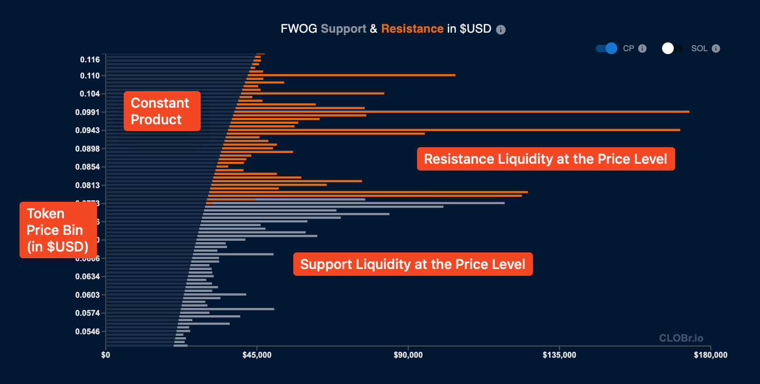
CLOBr depth chart components
Reading the Chart
- Horizontal axis (bar length): Represents amount of $USD (or SOL, if toggled) at each price level
- Vertical axis: The price levels for the token, in $USD (or SOL, if toggled). Each bar is a 1% price change from the bar above and below.
- Gray bars (below current price): Buy liquidity/support. Sells get absorbed by this liquidity. Bigger bars indicate more support, making it harder for the price to break below.
- Orange bars (above current price): Sell liquidity/resistance. Buys get absorbed by this liquidity. Bigger bars indicate more resistance, making it harder for the price to break above.
- Constant Product bars: The bars that represent the constant product of the liquidity pools. This liquidity behaves predictably at all price levels and does not cause buy and sell "walls."
Visible Range Control Slider
The slider controls which price range is visible in the charts, from -90% to +1000% of current price. The range buttons are shortcuts for popular ranges and affect all charts on the page.
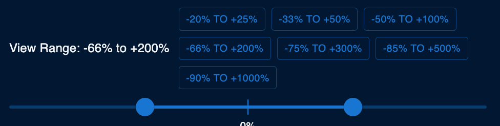
CLOBr range control slider
Summary
- Collection: CLOBr pulls data from Raydium, Orca, Meteora, Jupiter, and CEXs
- Processing: Data is normalized to USD, bucketed into 1% intervals, and aggregated
- Visualization: The depth chart shows support (gray) and resistance (orange) at each price level
Next: Token Detail Pages covers the CLOBr Score and liquidity heatmap.