Liquidity Ratios
One tab that divides things: volume by liquidity, float by supply, support by resistance. Ratios expose what raw numbers hide, and you can build and alert on your own.
Table of Contents
Why ratios beat raw numbers
$500K of volume means nothing until you know how much liquidity absorbed it. $100K of buy walls means nothing until you compare the sell walls above. Raw numbers on their own are how memecoin marketing works; ratios are how positioning works. The Liquidity Ratios tab (first tab on every token page) is CLOBr's division-first view of a token, and the same percentile math ranks every token so you know whether 1.2x is impressive or average.
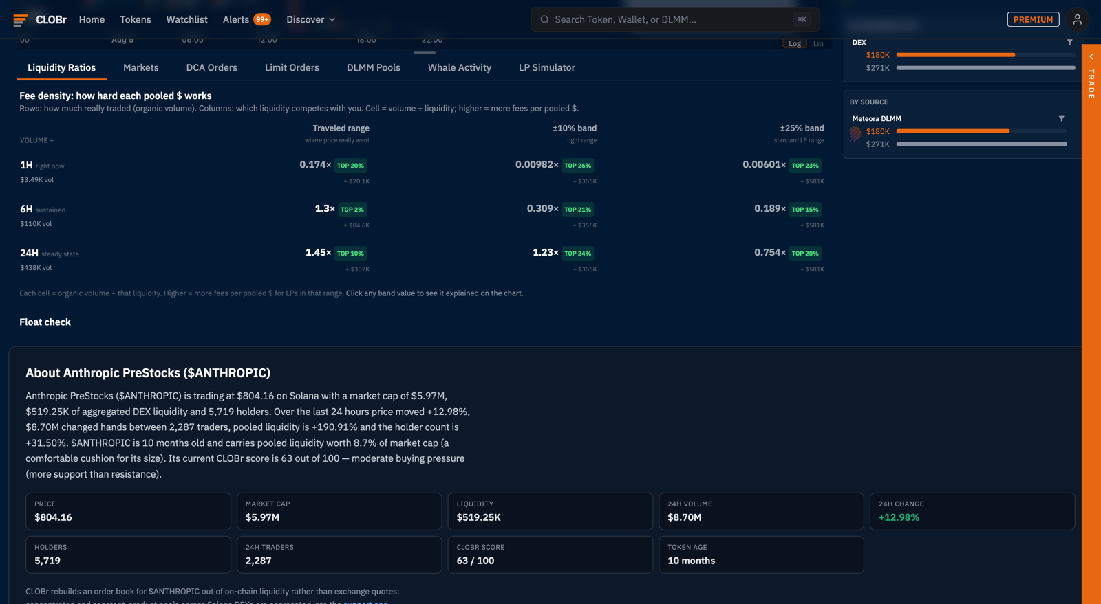
The fee density matrix
Rows: how much really traded. Organic volume in three windows: 1H (right now), 6H (sustained), 24H (steady state).
Columns: which liquidity competes with you. Three denominators: the traveled range (pooled dollars where price actually went), the ±10% band (a tight range), and the ±25% band (the standard LP range).
Cell = volume ÷ liquidity. Higher means more fees per pooled dollar. Each cell carries a percentile chip (TOP 10%, TOP 24%...) ranking the token against the whole tracked universe, and clicking any band value explains it on the chart.
Two reading patterns cover most situations:
- Down a column: is activity accelerating? 1H above 24H means flow is arriving; 1H far below means the day's number is coasting on an earlier burst.
- Across a row: how tight is the action? Strong in the traveled range but weak at ±25% means fees concentrate in a narrow band; a wide passive range would mostly sit idle.
The ecosystem-wide versions of this number: the LP Fee Cheat Sheet (per token) and the fee density columns on the screener.
Float check
Market caps and per-holder math assume the whole supply trades. It rarely does. The float check reads where supply actually sits so you can discount what never moves: locked or team-held allocations, dormant whales, LP-pooled supply. A "$6M market cap" token whose real float is a fraction of supply moves like a much smaller token, in both directions. Check the float before trusting any per-market-cap comparison.
Support / Resistance profile
The single CLOBr Score compresses buy-side vs sell-side pressure into one number. The S/R profile un-compresses it: directional bias computed per bin window, so you can see where the score comes from. A token can score a neutral 50 overall while being heavily supported close to price and heavily walled far above: tradeable structure the single number hides.
Custom ratios
The builder at the bottom of the tab lets you divide any tracked metric by any other: pick a numerator, pick a denominator, save. Saved ratios compute live on the token page under "Your custom ratios." Combinations traders actually use:
- Organic volume ÷ holders: real activity per holder; separates communities that trade from communities that hold a bag.
- Support liquidity ÷ market cap: what fraction of the valuation is defended by real bids. The cushion metric.
- DCA buy pressure ÷ support liquidity: how much scheduled buying is coming relative to the book it lands on.
Ratio alerts
Any ratio, built-in or custom, can fire an alert when it crosses a threshold. This is the difference between checking a dashboard and being told: save "support liquidity ÷ market cap" and alert below 0.05, and you hear about the cushion thinning before the chart shows it. Channels and delivery are the standard CLOBr Alerts system.
Quick reference
- Fee density matrix: volume windows ÷ liquidity bands, percentile-ranked
- Float check: where the tradable supply actually is
- S/R profile: the CLOBr Score, un-compressed by bin window
- Custom ratios: any metric ÷ any metric, saved per token
- Ratio alerts: threshold alerts on any of the above